Building a holistic home for Australia’s favourite supplements brand
Bio Island is one of Australia’s leading manufacturers of nutritional supplements and a major supporter of Swimming Australia. They have an international customer base extending to China.
Part of their strategic evolution as a brand was to become more holistically-focussed. They planned to position themselves as a health resource, providing nutritional advice to families. This brand evolution saw them redesign their packaging, and so an overhaul of the website was planned in alignment with this.
Working through the design and build process with Deepend exceeded my expectations. We worked smoothly and iteratively, fusing both the BioIsland and Deepend teams into one, high functioning unit.
Garry Law - Marketing Director, JBX / Bio Island
Given the international nature of their audience, a fine balance had to be struck in both the design and the tone of the site. This was important to ensure that it catered and appealed to a wide variety of users from around the globe. This extended to broadening its content strategy too, with allowances made for this to grow exponentially over the coming year.
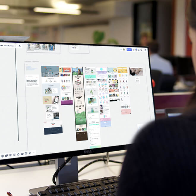
Drawing from Experience
Design inspiration was pulled from a wide variety of sources – from wellness blogs, pharmaceutical brands that were pursuing more holistic content strategies. This allowed us to build out a mood board and content roadmap based on successful tactics that others had pursued previously.
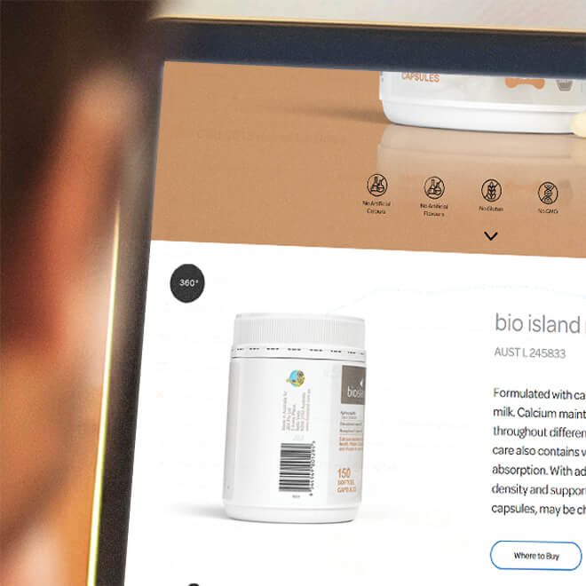
Interactive Design
Simple but effective interactive elements were implemented to hero the products and to make for a more engaging experience.
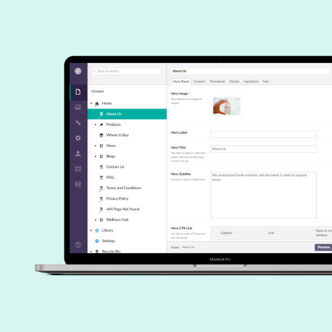
Built for Efficiency
Built on the Umbraco CMS platform, the site looked to extend the existing HTML framework, delivering build efficiencies to the project and minimising technical debt.

Developed for Flexibility
The website is designed and built to be highly modular, providing the Bio Island content team with flexibility in arranging and building out pages over time.
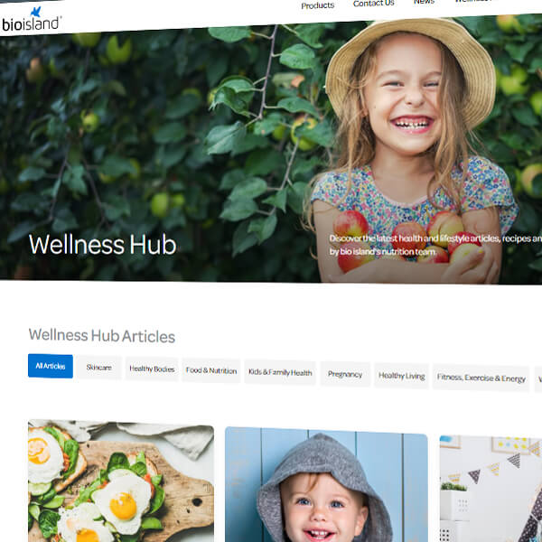
Content Developed for Results
The “Wellness Hub” was added to grow the brand's search footprint over time as well as aligning with the broader strategy of becoming lifestyle-oriented.
Building with Search in Mind
The new site design has removed the previous approach of using content within tabs. This is to expose more content to search engines to read simpler and faster way.


